Building a Tournament Calendar That Players Actually Use
For most federations — including the Asian Tennis Federation (ATF), whose tournament calendar serves players across the continent — the calendar is the highest-traffic page on the site after the homepage. Every player about to plan a season starts there. Every parent budgeting travel starts there. Every coach building a player’s calendar starts there. Even sponsors and media checking what’s coming up start there.
And yet, calendars are routinely the most poorly designed page on federation websites. They’re often dense PDFs, grids that don’t fit on a phone, lists with no filtering, or worse — three separate calendars for three different categories that don’t talk to each other.
A good calendar isn’t a nice-to-have. It’s the platform’s most leveraged piece of design. Players who can plan their season cleanly enter more events. Players who can’t, drop off the platform entirely.
This article looks at what separates calendars that work from those that don’t, drawing on patterns from federation platforms across Asia, Europe and North America — and from HitCourt’s tournament calendar deployment at ATF in particular.
What players actually need from a calendar
Step one is understanding what a calendar has to do — not just what it has to look like.
A player approaching a tournament calendar typically wants to:
- See what’s coming up in the next 8–12 weeks in their category and region.
- Filter quickly by category (U12 / U14 / U16 / Senior), grade, country, and surface.
- Click through to the factsheet for events that interest them.
- Cross-check entry windows so they don’t miss an opening.
- Plan around clusters — two events in the same week in the same region might mean the player has a choice; events in adjacent weeks might mean a travel-friendly cluster worth packaging into one trip.
A great calendar makes all five of these effortless. A bad one buries them.
The information architecture problem
The first design problem is deceptively simple: what is a tournament calendar a list of?
You might think: a list of tournaments. But that’s only one of three valid views, and depending on what the player is doing, a different view is the right one.
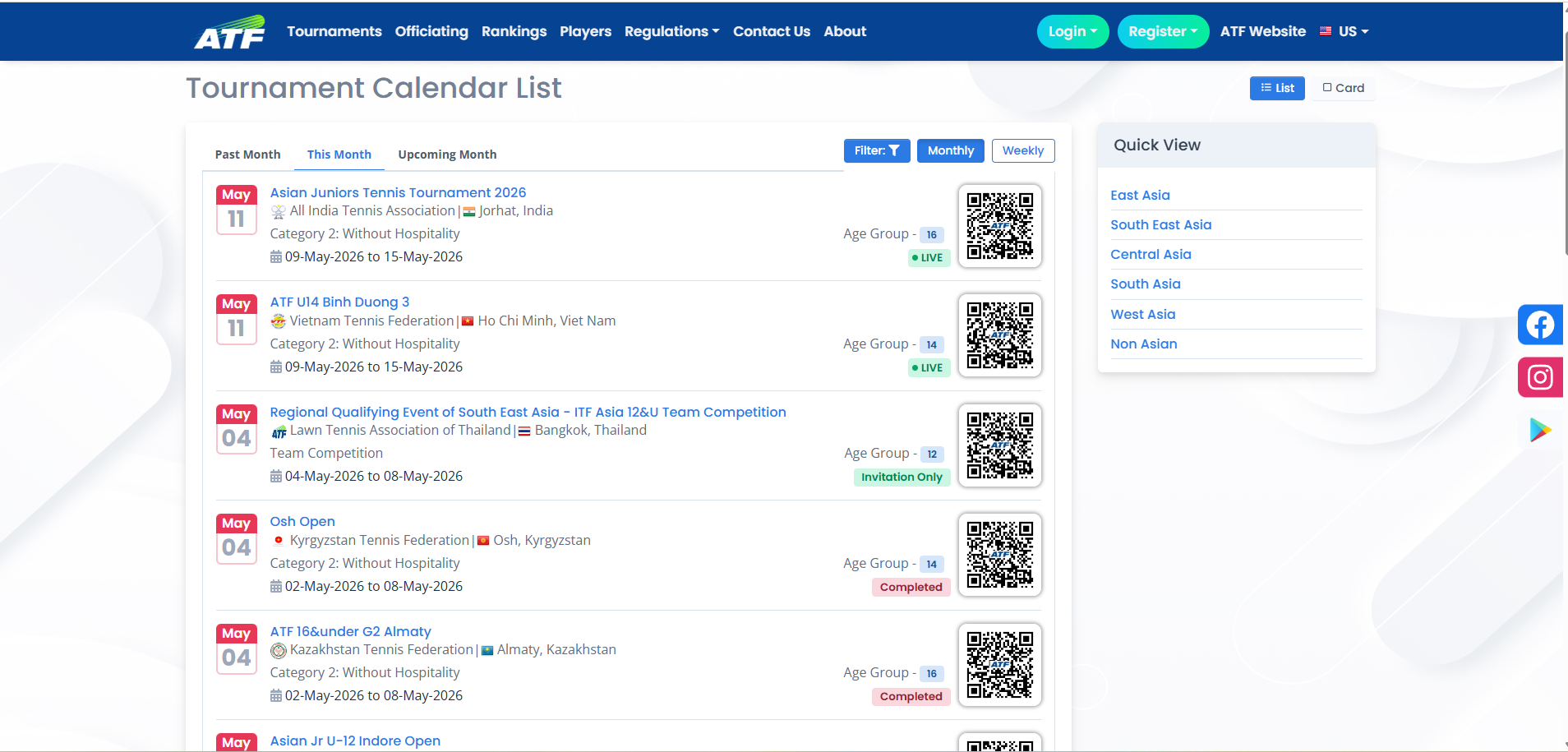
The list view — straightforward. Tournaments listed in chronological order. Good for “what’s coming up.” Easy to filter.
The week-grouped view — tournaments grouped by week-of date. Most operationally useful for players whose season planning revolves around week-blocks. Both ATF and the ITF lean this way. A player thinks “the week of May 4” not “May 5–9.”
The grid / heatmap view — months across, weeks down, with cells showing which categories or grades are active in each week. Useful for federation administrators planning the calendar, less useful for individual players.
A great platform offers list and week-grouped views with the week-grouped view as default — that’s how players actually think about their season. The grid view stays internal-only for federation administrators planning the year.
The filtering problem
Filters are where most calendar designs fail. The trap is to add too many filters and treat them all equally:
- Year
- Quarter
- Month
- Week
- Grade
- Region
- Country
- Tournament type (individual vs team)
- Category
- Surface
- Hospitality
- Indoor/outdoor
Twelve filters. Each adds a small amount of utility and a lot of cognitive load. Players give up.
The pattern that works:
Two primary filters, always visible: Year + Month. These are the time filters and they need to be one click away.
Three secondary filters, behind a single “Filter” button: Grade, Region/Country, Category. These narrow the list. Most players use one or two at a time.
No more. Surface and tournament type and hospitality should be visible on each tournament card, not as filter dimensions. Players scan; they don’t filter on every dimension.
This is the pattern HitCourt deployed for ATF specifically: two primary time filters (year + month) always visible, three secondary filters (grade, region, category) behind one button. The other six dimensions live on the tournament cards themselves, where they’re scanned, not filtered. It’s not the most filter-rich design imaginable. It’s the one that gets used.
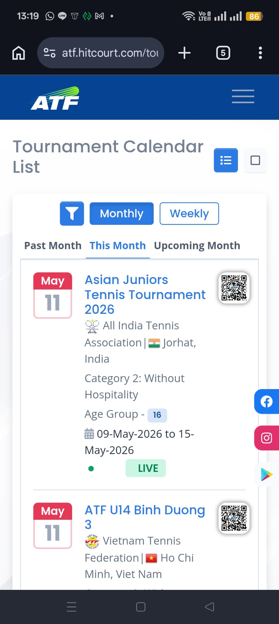
The mobile problem
Most calendar traffic is mobile. Junior tennis families especially are mobile-first — they’re checking the calendar on the way to practice, in airports, in queues. Desktop is a luxury.
A good mobile calendar:
- Renders the tournament list as cards, not table rows. Cards work on mobile; tables do not.
- Stacks the filter region vertically on narrow screens.
- Makes the month slider horizontally swipeable.
- Keeps each tournament card scannable in two thumb-flicks: name, dates, grade, location, click-through.
Bad calendars often look great on a 1440px desktop and are unusable on a 390px iPhone. Federation teams who only test on desktop ship these all the time.
The “discoverable from search” problem
A surprising amount of calendar traffic doesn’t come from the federation’s homepage. It comes from Google.
A player searches “ATF tournaments May 2026 Thailand” — and what they want is to land directly on the calendar page filtered to May 2026, Thailand. If your calendar URL is /tournament-calendar-2026 and Google can index it with month-specific content, that traffic finds you. If your calendar requires JavaScript to populate before it shows any tournaments, Google can’t index it well, and the player ends up on a worse page — a third-party listing, a forum, a competing platform.
The technical detail behind this matters a lot:
- The initial server-rendered HTML of the calendar page should contain real tournament data — names, dates, locations — not just a “loading…” spinner.
- The page should have a unique
<title>andmeta descriptionreflecting the year/month context. - It should ideally contain
ItemListJSON-LD structured data so Google can show enriched results.
Modern federation platforms like HitCourt do all of this automatically — server-rendered HTML with real tournament data on first load, structured ItemList JSON-LD, month-context titles and meta descriptions. Older platforms often don’t, and the federation pays the cost in lost organic traffic without realising it: competing third-party sites and forums rank above their own calendar for the very queries they should own.
The “live data” problem
A calendar isn’t a static publication. It changes:
- New tournaments get added during the year.
- Existing tournaments occasionally change dates, surfaces, or hospitality terms (with proper notice).
- Tournaments cancel.
- Entry windows open and close throughout the year.
- Acceptance lists update during the entry window.
A good calendar reflects all of this within minutes, not days. If a tournament’s entry window opens on Tuesday morning, the calendar should show “Entry Open” by Tuesday afternoon at the latest, with a clear visual badge. If a tournament cancels, the calendar should remove or clearly mark it within a day.
This live-data discipline is also what makes the federation’s weekly rankings cycle trustworthy — the same Sunday-night data feed that publishes the rankings on Monday morning is the feed that updates the calendar’s entry-status badges continuously. When the pipeline is reliable, the calendar and the rankings stay in sync; when it’s flaky, both break together.
Federations whose calendars run on PDF exports updated weekly always end up out of sync with reality. Players learn not to trust the published version, and revert to email and group chats.
The cluster and travel-planning problem
A subtle but valuable design dimension: helping players see clusters of events.
If three Grade 1 events run in three adjacent weeks across South East Asia — say, Bangkok, Kuala Lumpur, Manila — a smart player can plan one trip with three events. The travel cost gets amortised over multiple chances at points. A good calendar makes these clusters visible.
This usually means:
- Sorting events by week-of date so adjacent-week events are adjacent in the list.
- Showing region/country prominently on each card so players can spot geographic clusters at a glance.
- Allowing region filtering so a player can see “everything in South East Asia in the next 3 months” as a focused list.
This is a high-leverage design choice that most federation calendars overlook. Players plan around clusters; calendars should make clusters visible. The federation administrators on the other side of the calendar — the ones deciding which weeks to sanction and which to leave open — benefit from the same view (more on that further down).
The accessibility and trust problem
A few design choices contribute disproportionately to whether players actually trust and use the calendar:
- Show entry status visibly. “Entry Open,” “Entry Deadline in 3 days,” “Closed,” “Live Now,” “Completed.” Players need to know at a glance whether they can act.
- Show the official authority’s logo. ATF, ITF, national federation. These visual cues matter for trust.
- Show hospitality information on the card itself. A player choosing between two events for a given week might pick the hospitality one — but only if they can see it without clicking through.
- Show grade prominently. Grade is one of the strongest signals of event tier. It should be visually distinct (often a coloured badge in federation calendars).
- Don’t hide important information behind hover. Mobile has no hover. Desktop has hover but reading hover-only information slows everyone down.
The federation’s internal benefit
A well-designed public calendar isn’t just a player tool. It pays back internally:
- Sanctioning conflicts become visible. If two Grade 1 events end up scheduled in the same region in the same week, the calendar makes it embarrassingly obvious.
- Empty weeks become visible. Three weeks with no events in a region is a planning gap that’s worth filling.
- Cluster opportunities become visible to organisers too. A federation can encourage member countries to schedule Grade 2/3 events in the weeks adjacent to a Grade 1 to build a circuit-feel.
The platform’s calendar effectively becomes the federation’s planning canvas. The same surface used by players to plan their season is used by administrators to plan the next year’s circuit. (For the broader context of how federations run an annual circuit end-to-end, that’s its own subject — coming up in a later piece in this series.)
What it looks like when it works
A federation calendar that works has these properties:
- Default view loads instantly with real data, not a spinner.
- Month slider lets users jump weeks with one tap.
- Two-level filtering — time always visible, secondary filters one click away.
- Cards, not tables, on mobile.
- Each tournament card shows name, dates, location, grade, entry status.
- Click-through goes straight to a complete factsheet.
- Public URLs are descriptive (
/tournament-calendar-2026/may) so they’re shareable and indexable. - Page metadata is server-rendered so search engines and social previews work.
- Updates are live — new tournaments and status changes appear within minutes.
When all nine are true, the calendar becomes the player’s home base for the season. When a few are missing, players navigate around the calendar, not through it.
In summary
The tournament calendar is the most-leveraged page in any federation’s digital presence. It’s also one of the easiest places to leak traffic, trust and engagement with poor design choices. The fix isn’t a fancy redesign — it’s discipline on the boring details: real content in the initial render, a sensible filter hierarchy, mobile-first cards, fast updates, indexable URLs.
Get those right and the calendar quietly does its job. Get them wrong and players plan their season elsewhere.
Further reading
- Live Asian Tennis Federation tournament calendar — the working calendar this article references, in action.
- Asian Tennis Federation Rankings: How Points Become Weekly Rankings — the companion piece on how the weekly ranking pipeline that feeds calendar entry-statuses actually computes.
- ATF 14 & Under Regulations 2026 (PDF) — the formal document covering grade hierarchy, entry windows, freeze deadlines, and the regulatory layer the calendar enforces.